
Redesigning the Flyhomes Blog to Drive User Engagement and Business Expansion
Discovery: Challenge in the existing blog
As part of my role at Flyhomes, I was tasked with redesigning the company's blog, a key platform offering valuable insights and advice for prospective homebuyers. Upon examining the existing site, several challenges became apparent:
Cluttered Layout: The blog lacked a clear structure, resulting in a visually overwhelming experience for users.
Verbose Navigation: The navigation menu included overly long labels, making it difficult for users to quickly find the information they needed.
Unclear Call-to-Action (CTA): The CTA button, a crucial driver of conversions, lacked prominence and engaging language.
These issues made it difficult for users to engage meaningfully with the content, negatively impacting engagement and conversion metrics. Addressing these challenges presented an opportunity to align the blog with Flyhomes' growth objectives.
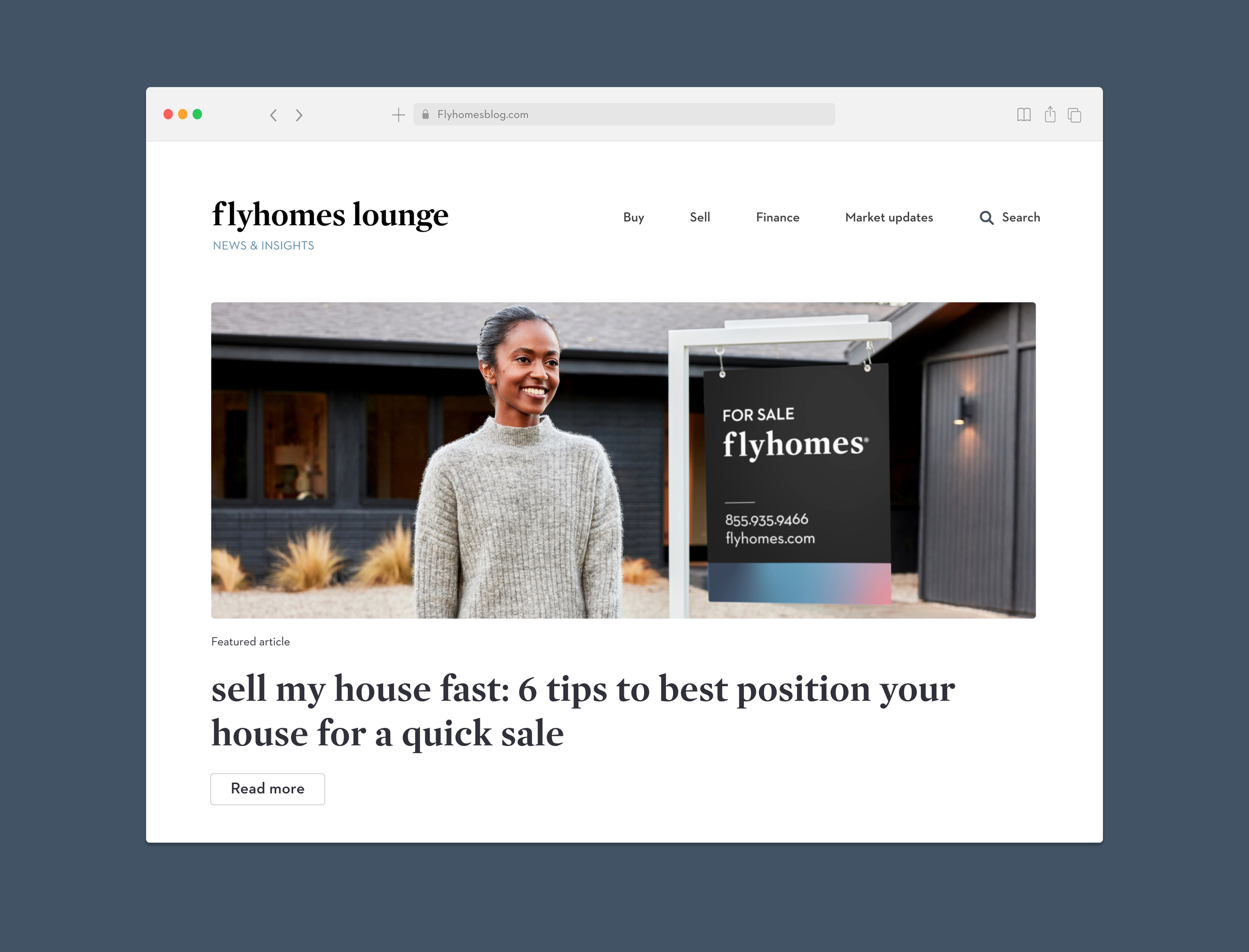
My solution: Designing for Growth and Engagement
The redesign focused on creating a blog that serves as both an engaging content hub and a driver of Flyhomes’ growth strategy. Key design strategies included:
Organized Layout: Introduced a clear hierarchy with sufficient negative space to improve readability and reduce visual clutter.
Streamlined Navigation: Simplified the menu with concise labels and intuitive categorization to enhance user accessibility.
Enhanced CTAs: Made the call-to-action button more prominent with a contrasting color and action-oriented language to boost conversions.
Responsive Design: Built a mobile-first design to address high mobile bounce rates, ensuring seamless functionality across devices.
Figma Prototypes and User Flows: Delivered interactive prototypes and detailed user flows to guide the development team.
Before

After


